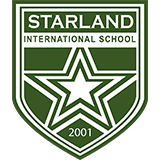
Logo Interpretation
White
1. Purity of service
2. Genuine school-home relationship
3. Value-laden school culture
Green
1.) Blooming field of learning
2.) Healthy and wholesome school environment
3.) Blissful pool of talents
Three (3) Badges
1.) To teach with passion
2.) To touch with compassion
3.) To transform with great success
Stars
1.) Guiding light for a bright future
2.) Enlightenment of mind, heart, and spirit
3.) Illumine dreams to become reality
Curves
1. Flexibility and adaptability in knowledge acquisition
2.) Versatility and diversity
3.) Determination to overcome challenges
Three (3) White Stars
1.) Preschool
2.) Elementary
3.) High School
Two (2) Green Stars
1.) College
2.) Graduate School
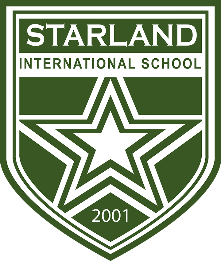

The Birth of A Star
The evolution of the Starland International School logo beautifully reflects the school’s growth and expanding vision. Here’s a breakdown of how the logo has evolved alongside the school’s transformation:
2001
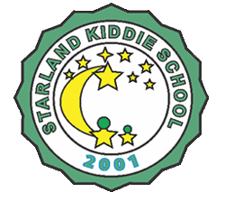
Starland Kiddie School (SKS)
The initial logo featured a crescent, symbolizing the enthusiasm and passion foundational to the school. The addition of two children within the logo represented the Basic Education Programs – Preschool and Grade School – that SKS offered. This design embodied the school's initial focus and its commitment to early education.
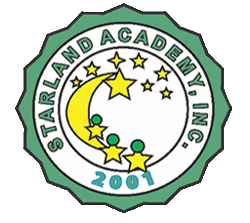
Starland Academy, Inc. (SAI)
In 2005, as the school expanded with branches in Cubao and Caloocan, the transition to Starland Academy, Inc. was marked by an updated logo. The addition of a third child in the silhouette in 2006 signified the expansion of the school's offerings to include the first to fourth year levels of Secondary Education. This change in the logo represented the school's growth and its broader educational scope.
2005
2007

Starland International School (SIS)
The academic year that saw the inclusion of students from diverse nationalities – Chinese, Koreans, and Arab nationals – marked a significant milestone, leading to the establishment of Starland International School. The new logo for SIS was crafted by Rodin Calusa, a former graphic artist and web designer with international experience. His expertise, combined with his dedication to the school, resulted in the creation of a logo that encapsulated the international essence and expanded vision of the school. This logo symbolizes not only the school's commitment to a global and inclusive educational environment but also its continuous evolution in meeting the diverse needs of its international student body.
2001

Starland Kiddie School (SKS)
The initial logo featured a crescent, symbolizing the enthusiasm and passion foundational to the school. The addition of two children within the logo represented the Basic Education Programs – Preschool and Grade School – that SKS offered. This design embodied the school's initial focus and its commitment to early education.
2005

Starland Academy, Inc. (SAI)
In 2005, as the school expanded with branches in Cubao and Caloocan, the transition to Starland Academy, Inc. was marked by an updated logo. The addition of a third child in the silhouette in 2006 signified the expansion of the school's offerings to include the first to fourth year levels of Secondary Education. This change in the logo represented the school's growth and its broader educational scope.
2007

Starland International School (SIS)
The academic year that saw the inclusion of students from diverse nationalities – Chinese, Koreans, and Arab nationals – marked a significant milestone, leading to the establishment of Starland International School. The new logo for SIS was crafted by Rodin Calusa, a former graphic artist and web designer with international experience. His expertise, combined with his dedication to the school, resulted in the creation of a logo that encapsulated the international essence and expanded vision of the school. This logo symbolizes not only the school's commitment to a global and inclusive educational environment but also its continuous evolution in meeting the diverse needs of its international student body.
